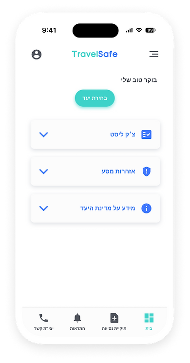
Mobile app case study
INTRODUCTION
Travelsafe is a mobile app for Israeli travelers to manage documents before flights and to connect to embassies abroad.
This case study was part of a UX learning exercise during which I researched and designed the app and logo while creating the optimal experience for its users.
THE CHALLENGE
Travelers from israel have no convenient way of managing their documents and uploading them in a secure way as well as contact government officials abroad and receiving real time alerts and information about their destination country.
MY SOLUTION
Create an app containing easier ways to upload documents, by making a travel folder in which important documents can be scanned and accessed even offline, as well as constant alerts from the government about domestic regulations and foreign regulations concerning travel and important information.
THE PROCESS
I started this process by searching travel apps, insurance apps, as well as the Israeli travel app that was created recently.
I wrote what needs to be removed as well as features that I wanted to improve. In a lean canvas I started the thought process and possible scenarios.


DESIGN LANGUAGE
After setting up the wireframe, I went on to creating the design language of the app, searching color palettes that are common in the industry and improving on them with my own touch.

#3ED2C9
#4278FF
#FFFFFF
COMPONENTS
To avoid too much text and noise in the eyes, every component containing text was minimized with the ability to expand. Using the color palette consistently creates a coherent experience.


A problem I encountered while working on the wireframe was that the checklist could take too much real estate in the screen, so I used a scroll function inside the component.


